link : http://www.webplay.org/index.php
This website ,I think it is just suitable for children play because the color, font and the logo are so cute. The designer understands the purposes for this website. Therefore, he make everything is in one themes and every element included the ideas that he supported. However, if it applies to Saigon player ,it is totally different. It is not suitable for applying it because the Saigon player is the place which is performed for maturity people. It has to be very formal .
Sunday, July 22, 2007
Sunday, May 20, 2007
Closure of shelf advertising
I designed it for my friend . she uses it for the market plan of one stationary shop. Based on the concept of closure . I'd like to design these images
Tuesday, May 15, 2007
Portrait myself as the hero
Spacing
Wednesday, May 9, 2007
Fruit shop logo
Tuesday, May 1, 2007
The typographic loom
The loom - the concept of closure
Monday, April 23, 2007
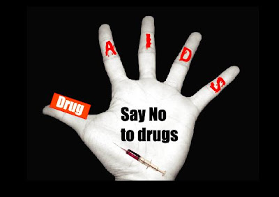
The welfare poster
This is also one of my assignment in Maddy class . It calls welfare poster. I'd like to make the Anti Drugs poster. Before I do this process , I researched from the streets and the internet. The concept that I used here are spacing, collage and typography...
Closure
Based on the concept of closure , I've created the logo for my friend whose name is Judy. I've used the lines to create the apples and then put the diamond on the apple's line direction. After that I deleted the lines but we can see that Diamon still go from the line direction.
Sunday, April 22, 2007
Have a look at this link!
Hey guys. I would like to share this link for you because I think it's useful for trainning skills on Illustrator, photoshop and etc. In this website, there are a lot of great tutorials for design . I hope it could help. Have fun.
http://www.ndesign-studio.com/
Monday, April 16, 2007
chinese cultural plate
This image that I took in the Vietnamese traditional food of restaurant which name is Nam Giao.I think this image contains alots of artworks of design. It made in china so all of this artworks related to chinese culture. The designer used the repeatation of the circle to balance his artwork. Eventhough we move it into different the artwork is always balanced. The typography is used in very traditional and old font styles. Moreover, he added more animal symbols to represent the happy life of people. In thinks my of opinion, I thinks it's great.
Tatoo artwork of mine
In cultural thinking of Vietnamese people, tatoo seems to be used bad person . However, I think tatoo in different ways. Do you think people who don't has tatoo is totally good person? ....Moreover, I think it contains a numerous of artworks. This is one of one of artwork and my friend also is going to use it for his tatoo.
First of all, before I sketch the tatoo , I always keep the principle elements of design in my mind. In this this artwork, I would like to use : balance, spacing , typography and line ( curves)
Let's have a look.
Sketching image:
Final version:
Friday, April 13, 2007
Balance
During I work on my second assignment. After taking all images for my project, this image make me think about the balance concept. The towel handle looks like balance with the another towel handle through the mirror. However , there was a little part of handle which was missed. Anyways, through the closure concept of design , people will recognize that part is not hidden actually.
Self Portrait as a Machine
This is my second Assignment in class . The concepts which I used in this portrait are collage, closure, over-lapped and continuance. I made the theme which is bathroom equipments. Then I bring all the equipment images together to cover my face as a machine (Collage concept).
The equipments are also over-lapped on different layers. Even though the equipments cover my whole face but people still recognizes the curves of the face looks like human. It has two eyes, the mouth, the head and the shoulder (Closure concept). For the background, I brushed the lines and used the radial blur effect. It likes moving in the circular ways (continuance concept).
Friday, April 6, 2007
Balance typography
In this image, I'd like to combine the closure , organic font , shape and balance together . I makes from the ideas of balance . I also changed the shape some characters which shows the concept of continuance on 2 bar of color. It looks like the letter is moving down. Actually it just grab the viewer eyes direction.
Font and Typography
Suitable font also contained the meaning for the concept of design. Here I'd like to show that only 1 word "destination" with 3 different types of font bring back 3 different feeling .
For the first one, it seems to be scared or dead. With the red color and organic font , the word look like bloody writing.
Second one, the font looks like fun and cute. Therefore, pink color of back ground is suitable .
Third one looks like something which is so serious . This is because the font was used in inorganic style. It likes something banned with the destination words
Thursday, March 29, 2007
Typography
TODAY, I JUST STUDIED ABOUT THE TYPOLOGY AND SAW ABOUT THE TYPOGRAPHY FROM SOME GREAT DESIGNERS. I WENT HOME AND DID IT IMMEDIATELY. HI HI.. THE CONCEPT IS ABOUT TYPOGRAPHY, CONTINUANCE, SPACING AND CLOSURE. LET'S HAVE A LOOK .
The Collage
Wednesday, March 21, 2007
A key to success
One day, I think about the future. I ask myself that " What will my future be ?" , " Will it be successful?" . Therefore , I think it tottally depend on myself . With hard working, more creativity and good trainning , one day I will find the way as the golden key to open the success in the future.
The concept I used which was continuance concept . With the golden key, I made many blur layers . I made the feeling like the key was moving to the lock . Another movement that I created that is the text . I think it like moving in the circle direction.
The second concept is the over collapping and closure.Eventhough A the word "to" and the golden key over-collapes on the lock but I think the viewer will know the part which is over collaped. About the closure part , the lock just make by the combination of circle shape and the rectangle shape but I think the viewer will understand that is the lock ..
The Ghost Rider
After watching the movie " The Ghost Rider" which reminds me about my past. In the past, I was also the rider on the road . With my bike , I accelerated with the maximum speed. Finally, my leg was broken up. That was terrible thing in the past. That's why I love to use the tittle of the movie.
In this concept, I used spacing for my text. I seperate in 2 parts . In the first part, it looks like I cut out " the ghost" letter out of the black background color. The second part, it seems to be written the black text on the white background.
Moreover, another concept that I use is closure. Eventhough I cut out a half of my face but the viewers also will recognize my whole face. However , they don't know that my another half has 2 pimples . hiiiii :D.
Tuesday, March 13, 2007
Gestalt : The Secrect Life Of Plant
My concept in this picture is about space, continuance and closure . The space that I cut out the circle of the image and make the mark . Another image I make the opposite mark ,so the circle is the flowers inside. Moreover, the continuance which I concern here is the direction movement from the circle to the hole of image . Finally, the closure is that the image is hid with the hole but people still recognize that the image will be filled by the flower on the right side.
Sun and Moon Project
This is my first draft that I draw in class. I think I will use the over-lapping and spacing concept . In this case the Sun is the little circle which stay over-lapped on the moon. But I leave the space for the sun and not going to fill the color on it.
However , after studying some concepts of Maddy class . I would like to change some concept for my final Sun &Moon prject . I used the blur to create the movement for the sun. You can see the sun looks like it's moving into the moon. It make our direction move from the moon to the sun continuously . In addition, I still keep the overlapped concept .The sun still stay over-lapped on the moon. The closure concept also is used . As the over-lapping the moon on the sun, we still can recognize the hidden part of the moon. So let's have a look at it.
Monday, March 5, 2007
Natural effect
Why does it call natural effect? This is because I did not use any tool of photoshop software to change the image.
In this picture , I took from my chinese friend who is Kevin. It happened so sudden because while I was taking picture , I smoked. Suddenly the smoke made the natural effect for the image. hi hi...
The abbreviations for the figures on the necklace
I'd like to introduce 2 abbrivations of the necklace figures which I make for my friends. These designs were made in Photoshop Illustrator.
For the first one , I made for my friend whose name is Khuong . So I use the K letter for the abbreviation of the necklace.
P abbrivation stands for Phuong
For the first one , I made for my friend whose name is Khuong . So I use the K letter for the abbreviation of the necklace.
K abbriviation
The second necklace figure, I made for another friend whose name is Phuong. I also use the abbriviation P in the center of the figure on the necklace.
P abbrivation stands for Phuong
Subscribe to:
Posts (Atom)